HOLD ON! Midwest Magic is moving! Yup...after over 25 years, we will NO LONGER BE IN FRANKLIN PARK, IL. In view of this overwhelming undertaking, we WILL NOT BE ACCEPTING ORDERS until our new site is ready. We hope to be back up to speed as soon as possible, and in the mean time, we appreciate your patience and understanding. Thanks!
Category
Related Items
PLAYING CARDS--PAPERWAVE VENOMOUS
PC-9299
Paperwave Venomous Edition is our most colorful deck yet! Bringing a stylized modern look that pays homage to poster art, graffiti, and chromatic typography. Printed in a super limited run of only 1000 decks by the United States Playing
$15.95

PLAYING CARDS--ARISTO V-TWIN
PC-9292
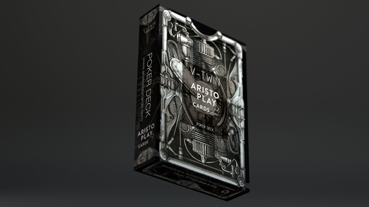
ARISTO PLAY CARDS presents V-TWIN POKER DECK. We are proud to display our brand new USPCC printed custom deck on 100% quality paper stock. V-Twin deck isn't just a playing cards. It's an expression of oneself. It is an expression
$15.95

PLAYING CARDS--PAPERWAVE GLYPH
Item Details
PLAYING CARDS--PAPERWAVE GLYPH
Item Name:
PLAYING CARDS--PAPERWAVE GLYPH
Item #:
PC-9291
Price/ea:
$16.95
Average Rating:

Product Image Gallery:

The overarching idea for Paperwave Glyph Edition Playing Cards was to create a direct comparison between all the different permutations of glyph (symbols or hieroglyphic character) combinations, and the endless amount of possibilities a deck of cards offers us. This design was born from a deep interest in typography and the search for unconventional typefaces that push the boundaries of form. I wanted to challenge the preconception of what a deck of cards can look like. The typeface used as building blocks for this deck was designed by my friend, and talented French type designer, Charles Quirouard. From there, I adjusted its curves, proportions, and specific dimension to properly fit my vision for this design. The moment I began experimenting with his typeface I realized it would look great as a back design. This quite abstract typeface has many beautiful moments that I wanted to highlight, but I couldn't include all 26 letters of the alphabet in one back without it feeling cluttered and chaotic. That's when the fitting decision of making a deck with 56 different back designs surfaced. Every single back design of the Paperwave Glyph Edition Playing Cards has been carefully crafted to create a harmonious interaction between letters. This being a very abstract typeface allows for the letters to act more like shapes, taking legibility out of the equation, and allowing the viewer to focus on the forms and negative space this partnering of letters creates. The 10 of clubs is my favorite card, and having the adapting slogan on the 10 of clubs on every deck is a special feature I will keep moving forward!

Quantity:
 
 
Item Reviews
This item has not been reviewed yet. Be the first to write a review!

The overarching idea for Paperwave Glyph Edition Playing Cards was to create a direct comparison between all the different permutations of glyph (symbols or hieroglyphic character) combinations, and the endless amount of
Powered by InetGuys, Inc